What We Did
Branding, web design and development
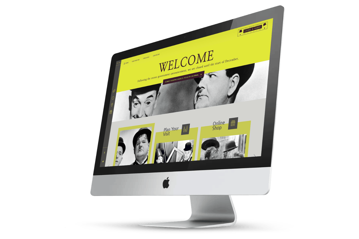
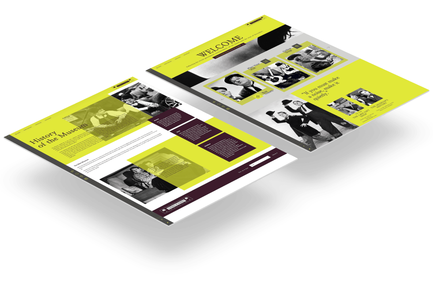
The client already had an existing site and brand, but it wasn’t really covering the offering as it stood. We thought it was missing a much needed sense of fun! We created a totally new brand for the museum – including logo, colour palette and iconography and typography sets. The aim was to create something that would sit well against the black and white imagery available, while creating a fun, engaging identity for the museum.
Enhancing a Great Attraction
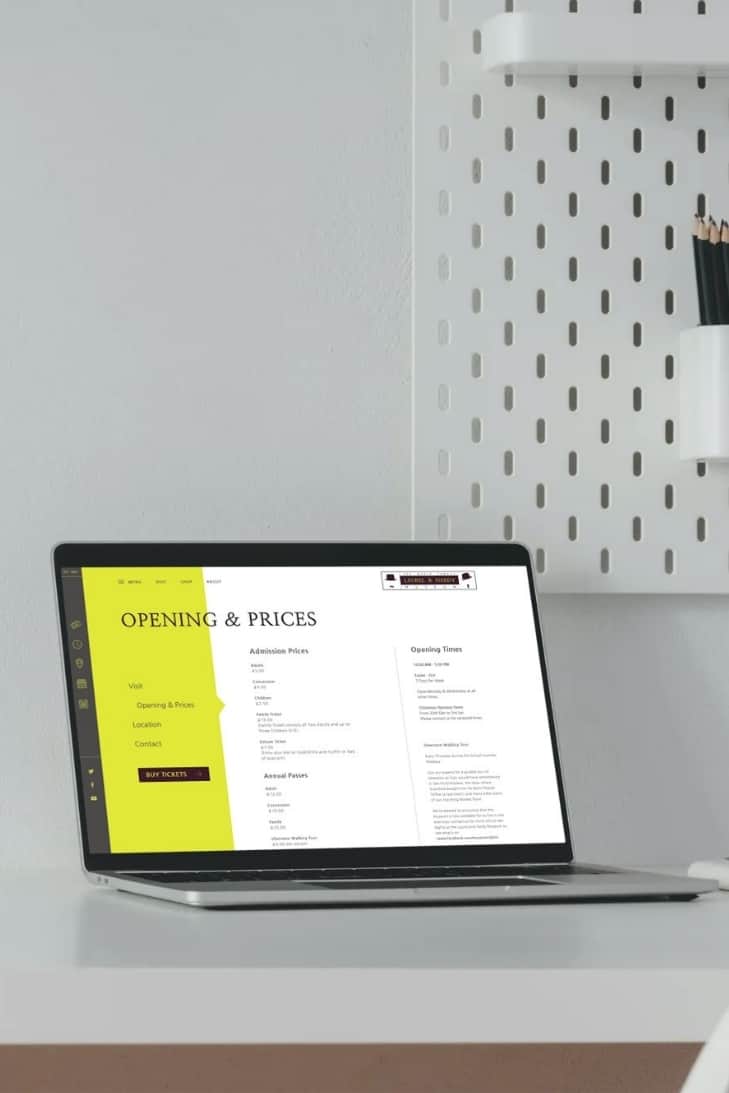
We wanted to create something easy to use from an information perspective, telling you everything you needed to know, while injecting that all important sense of fun. We felt the museum was a great attraction, and needed something that reinforced that to potential visitors.
The Final Result
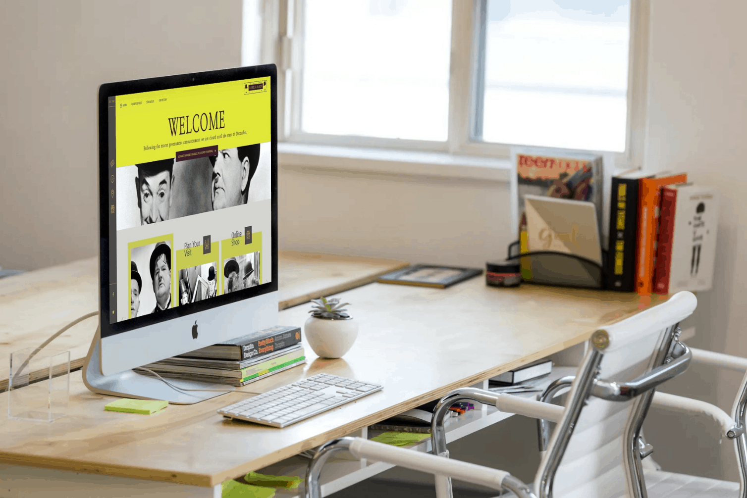
Through the use of fairly unique UI animations and bold layout styles, we think we achieved a fantastic new website and rebrand!


